Finding Color in the Shadows of Found Objects

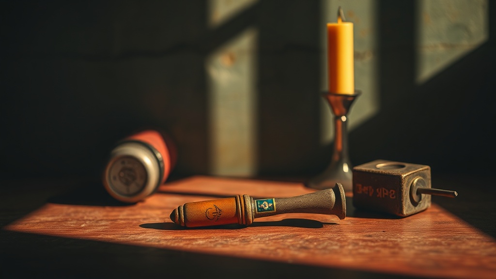
A rusted piece of industrial scrap metal sits in the corner of a garage, its surface a jagged map of oxidized oranges and deep, bruised purples. To most, it's just junk. To a visual artist, it's a masterclass in color theory. This post explores how to identify and extract color palettes from discarded, non-traditional objects to inform your painting and mixed media work. Understanding the relationship between light, shadow, and texture in found objects can change the way you approach a blank canvas.
Most artists look for inspiration in high-end pigment catalogs or professional color wheels. That's a mistake. The most interesting colors aren't found in a tube of paint; they're found in the decay of a discarded soda can or the weathered patina of an old copper pipe. When you look at the way light hits a dented surface, you see more than just a shape—you see how shadow creates depth through temperature.
How Do You Find Color in Found Objects?
You find color by looking past the primary color of an object and focusing on its weathered surfaces and shadows. A piece of weathered wood isn't just "brown." It's a complex layering of ochre, deep umber, and perhaps a sliver of silver-grey where the grain has been stripped by the sun. The secret is to stop seeing the object as a whole and start seeing it as a collection of micro-textures.
Take, for instance, a discarded piece of corrugated cardboard. Most people see a boring brown. But if you look closely at the edges where the fibers are torn, you'll see hints of pale cream, toasted tan, and even a slight grayish tint from the adhesive. These subtle shifts are what give a piece of art its "soul."
To practice this, I suggest a simple exercise. Grab a piece of "trash"—an old soda can, a crumpled piece of foil, or a broken ceramic shard—and place it under a single light source. Watch how the shadows aren't just black. They are often deep blues, violets, or even warm browns depending on the material. This is where the real magic happens.
If you're interested in how natural elements interact with light, you might find our post on creating botanical textures with natural pigments useful. It deals with a similar concept of extracting character from organic matter.
Why Does Texture Affect Color Perception?
Texture changes how light bounces off a surface, which directly dictates how our eyes perceive color. A smooth, glossy surface reflects light predictably, making colors look saturated and bright. A rough, matte, or pitted surface scatters light, which can make a color appear more muted or even "broken."
Consider the difference between a polished marble slab and a piece of rough sandstone. The marble reflects a sharp, high-contrast light. The sandstone absorbs it. This absorption creates a sense of "weight" in a painting. When you use found objects as a reference, you aren't just copying a color; you're trying to replicate the way that texture interacts with light. This is why many mixed media artists use impasto techniques to build up physical texture before applying color.
It’s a bit like a trick of the eye. A deep shadow on a textured surface isn't just a lack of light—it's a physical presence. If you're working with heavy-body acrylics or oils, you can actually mimic these shadows by building up the physical height of the paint. This adds a three-dimensional quality that a flat wash simply can't achieve.
Here’s a quick breakdown of how texture influences your palette:
| Surface Type | Light Interaction | Visual Result |
|---|---|---|
| Glossy/Smooth | Specular Reflection | High saturation, high contrast |
| Matte/Rough | Diffuse Reflection | Muted tones, soft transitions |
| Pitted/Corroded | Shadow Trapping | Deep, complex color depth |
What Tools Help Capture Found Object Colors?
The best tools for capturing these colors are high-quality colorimeters or, more simply, a well-organized set of professional-grade paints. You need a wide range of neutrals to effectively "break" your colors.
When I'm out in the field or even just scanning my studio, I don't use a digital color picker. I use my eyes and a sketchbook. I like to use a set of Winsor & Newton watercolors or heavy-body acrylics because they allow for layering. Layering is the only way to truly mimic the complexity of a found object. If you just paint a flat stroke of "rust," it's going to look fake. You need to layer a burnt sienna over a deep crimson, then perhaps a touch of unbleached titanium to get that gritty, weathered look.
A few things to keep in your kit:
- Graphite Pencils: For mapping out the physical structure and shadow shapes.
- Neutral Tinted Paper: Using a mid-tone gray or tan paper can actually help you see colors more accurately than bright white.
- High-Quality Brushes: You need tools that can handle both fine detail and broad, textured strokes.
The goal isn't to be a human camera. It's to be a translator. You are taking the visual information from a piece of scrap metal and translating it into a language of pigment and brushwork. It's a bit of a mental shift, honestly—moving from "what is this object?" to "what is this light doing to this surface?"
Don't be afraid to get messy. If you're working with found objects, your process should probably be a little messy, too. There's no reason to stick to a pristine palette when the very things you're studying are the definition of imperfect. I've found that using a palette knife to smear thick, undiluted paint can actually help you capture the "grit" of a weathered surface much better than a fine-tipped brush ever could.
The more you look, the more you'll see. That rusted bolt on your workbench isn't just a fastener; it's a spectrum of burnt orange, deep ochre, and midnight violet. It's a whole world of color hiding in plain sight. Go out and find it.