How to Use Warm and Cool Colors to Create Instant Depth in Your Paintings

Most painters don't realize that temperature—not value—is what separates amateur work from pieces that seem to pull viewers into another dimension. A 2019 study from the University of California found that viewers consistently rated paintings with deliberate temperature shifts as "more realistic" and "more emotionally engaging" than those relying solely on value contrast, even when the values were identical. Understanding how warm and cool colors interact isn't just theory—it's the difference between flat paint and atmosphere you can almost breathe.
Why Does Temperature Create Depth More Effectively Than Shading Alone?
Your eye has been trained by a lifetime of looking at the natural world. Warm light—sunlight, firelight, incandescent bulbs—throws cooler shadows. Cool light—overcast skies, north-facing windows, moonlight—creates warmer shadows. This relationship is hardwired into how we perceive three-dimensional space.
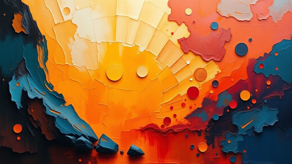
When you place a warm orange against a cool blue, something fascinating happens in the viewer's brain. The warm color advances. It feels closer, more immediate, almost touchable. The cool color recedes, slipping backward into atmospheric distance. Painters have exploited this optical phenomenon for centuries—think of how Monet's water lilies seem to float on infinite depths, or how Vermeer's interiors draw you through doorways that feel genuinely spacious.
Here's the practical application: when you're working on a landscape, resist the urge to darken distant mountains with black or brown. Instead, cool them down. Add a whisper of blue, maybe a touch of violet. Those same mountains, rendered in cool grays and blue-grays, will retreat convincingly into haze. Your foreground trees? Push them warm—golden greens, orange-browns, warm ochres. The spatial separation happens automatically, no perspective drawing required.
This works for portraits too. The planes of a face catching direct light read as warm. The shadowed planes under the brow, the side of the nose, beneath the chin—they read cooler. Paint a shadow with pure black mixed into your skin tone and you get a muddy, lifeless result. Paint that same shadow with a cooler version of the local color—perhaps adding a touch of ultramarine or alizarin to your mixture—and suddenly the face has sculptural presence.
How Do You Actually Mix Temperature Shifts Without Muddying Everything?
The fear most painters have—that playing with temperature will turn their clean colors into sludge—isn't unfounded. Temperature mixing requires restraint and knowledge of your pigments' biases.
Every color on your palette leans. Cadmium yellow leans warm (toward orange). Lemon yellow leans cool (toward green). Ultramarine blue leans warm (toward violet). Phthalo blue leans cool (toward green). Understanding these biases prevents the color mixing disasters that give temperature work a bad reputation.
When you want to cool down a color, don't grab "blue" generically. Grab a cool blue—phthalo or cerulean. When you want to warm something up, reach for a warm red like cadmium or a warm yellow like yellow ochre. Mixing warm with warm, cool with cool, keeps your mixtures clean and luminous. Cross the streams haphazardly—dumping a warm orange into a cool blue without intention—and you get the dreaded mud.
Try this exercise: Mix three versions of green. First, combine cadmium yellow (warm) with ultramarine blue (warm). You'll get a rich, olive green that feels earthy and grounded—perfect for foreground foliage. Second, mix lemon yellow (cool) with phthalo blue (cool). The result is a crisp, electric green that feels distant and artificial—ideal for atmospheric middle ground. Third, cross the temperatures: cadmium yellow with phthalo blue. You'll get a bright, neutral green that sits between the other two—useful for transitional areas.
The same principle applies across the spectrum. Warm red (cadmium) plus warm blue (ultramarine) gives a deep, rich violet. Cool red (alizarin) plus cool blue (phthalo) gives a lighter, more ethereal purple. Understanding these relationships lets you orchestrate temperature like a conductor directing an orchestra—each pigment playing its part in the spatial symphony.
Can You Apply Temperature Theory to Abstract and Non-Representational Work?
Absolutely—and perhaps even more powerfully than in representational painting. Abstract work has no recognizable subject matter to anchor the viewer, no tree or face or bowl of fruit to provide spatial cues. Temperature becomes the primary tool for creating visual hierarchy and movement.
Consider the work of Mark Rothko—those floating rectangles of color that seem to hover, breathe, and glow. Rothko wasn't just choosing colors he liked; he was engineering temperature relationships. A warm orange-brown rectangle placed over a cool blue-black ground creates tension—the warm shape pushes forward while the cool ground recedes. The painting becomes a space you enter rather than a surface you observe.
In your own abstract experiments, try this: Create a composition using only two colors, but push their temperature to extremes. A hot coral against an icy mint. A burning sienna against a glacial cyan. The spatial drama will be immediate and visceral. Now create the same composition using colors closer in temperature—perhaps a coral against a warm peach, or a mint against a cool turquoise. The energy collapses. The painting feels flatter, quieter, less urgent.
Even in geometric abstraction—think hard edges and flat planes—temperature determines which shapes dominate. A small warm square surrounded by cool gray will command attention despite its size. A large cool shape surrounded by warmth will feel like a window into depth. The color theory explorations of Josef Albers demonstrate this endlessly—how the same red can advance, recede, or vibrate depending entirely on what temperature surrounds it.
Common Temperature Mistakes and How to Avoid Them
Every painter battles certain temperature habits that flatten their work. The most common is "local color syndrome"—painting every object its "real" color regardless of lighting conditions. A red apple in cool northern light isn't red—it's a cool red, shifted toward crimson or even burgundy. Painting it cadmium red straight from the tube ignores the temperature reality of the scene.
Another trap is temperature inconsistency. If your light source is warm (golden afternoon sun), every highlight should lean warm and every shadow should lean cool. Break this rule—throwing a cool highlight on a warm-lit object—and the painting feels wrong in ways viewers can't articulate but definitely sense.
The solution is observation before brushwork. Spend time really looking at your subject or reference. Where is the light coming from? Is it warm or cool? Now check the shadows—are they the opposite temperature? Make notes. Squint to see past detail into broad temperature zones. Only then pick up your brush.
What's the Simplest Way to Practice Temperature Control?
Start with a limited palette designed specifically for temperature study: cadmium yellow (warm), lemon yellow (cool), cadmium red (warm), alizarin crimson (cool), ultramarine blue (warm), and phthalo blue (cool). Add white and maybe burnt sienna. That's it—eight colors that give you complete temperature control.
Paint simple still lifes: a single object under different lighting conditions. Your coffee mug in morning sunlight (warm light, cool shadows). The same mug by a north window (cool light, warm shadows). The same mug under your desk lamp (warm light, very cool shadows). Notice how the object's local color—its inherent redness or blueness or yellowness—shifts with the temperature of illumination.
Then move to landscapes. Paint the same scene at different times of day. The temperature relationships invert between sunrise and midday and dusk. Morning light throws long cool shadows across warm ground. Midday light is relatively neutral with subtle temperature shifts. Sunset throws everything into dramatic warm-cool opposition.
Keep a temperature journal. Small sketches—no larger than 4x6 inches—exploring nothing but warm-cool relationships. Don't worry about accuracy or likeness. Worry about whether the warm areas feel warm and the cool areas feel cool. Whether the space breathes. Whether your eye travels through depth rather than sliding across a flat surface.
Master temperature and you master the illusion of space, light, and atmosphere. Your paintings won't just depict subjects—they'll create environments viewers want to step inside. And isn't that why we paint in the first place?