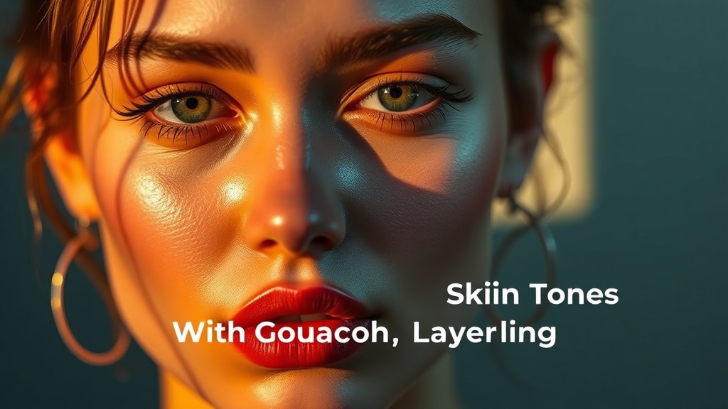
How to Build Luminous Skin Tones With Gouache Layering

Why Do My Gouache Skin Tones Look Chalky and Lifeless?
You've mixed the perfect peach, applied it confidently to your portrait—and suddenly your subject looks like a porcelain doll rather than a living, breathing person. Gouache has a reputation for turning muddy or flat when artists attempt the subtle gradations that skin requires. But here's the thing: the problem isn't the medium. It's the approach. This guide breaks down a layering method that builds warmth and depth from the first wash to the final highlight, giving you skin tones that actually feel alive.
The key difference between gouache and watercolor isn't just opacity—it's how the pigments sit on your paper. Watercolor sinks in; gouache sits up. That means every layer you add either contributes to luminosity or steals it away. The artists who make gouache sing understand that skin isn't painted—it's built, one translucent veil at a time, until the surface glows with accumulated light.
What's the Right Way to Prepare Your Surface?
Before any pigment touches paper, you need to understand what you're working with. Gouache performs best on paper that has some tooth but won't drink water too aggressively. Cold-pressed watercolor paper (140lb or heavier) gives you the texture you need without the battle against buckling. Some artists prefer hot-pressed for tighter detail, but that smooth surface shows every brushstroke—and skin rarely benefits from that kind of visibility.
Tone your paper first. This step feels counterintuitive when you're chasing bright skin, but a pale wash of raw sienna or yellow ochre establishes an immediate warmth that every subsequent layer will reflect. Think of it as installing a light source beneath your paint rather than painting light on top of darkness. Let this underpainting dry completely—gouache reactivates with water, and painting into damp layers will pull up pigment you want to keep in place.
Setting Up Your Working Palette
Limit yourself to six colors: titanium white, yellow ochre, burnt sienna, raw umber, alizarin crimson, and ultramarine blue. That's it. Skin contains every hue imaginable, but mixing them from a restricted palette forces you to make deliberate choices. Titanium white in gouache is powerful—use it sparingly in early layers, building opacity gradually rather than starting with opaque coverage.
Mix three puddles before you begin: a warm mid-tone (yellow ochre with a whisper of alizarin), a cool shadow mixture (raw umber plus ultramarine), and a highlight tone (mostly white with a touch of yellow ochre). These aren't your final colors—they're starting points that will shift and respond as you layer.
How Do I Build Layers Without Losing Transparency?
The first layer should surprise you with how thin it is. You're not covering the paper; you're staining it. Load your brush with more water than pigment and lay down the warm mid-tone across your subject's face, letting it pool slightly in the hollows of cheeks and temples. This wash will look too orange, too obvious—good. You're establishing the blood beneath the skin, not the surface itself.
Let this layer dry to the touch before proceeding. Here's where patience becomes technique: painting into semi-dry gouache creates the muddy streaks that frustrate so many artists. When you're ready for the second layer, mix your shadow color with slightly less water—think milk consistency rather than tea. Apply this to the planes that recede: under the brow, the side of the nose, beneath the lower lip. The shadow should sit on top of your warm base, not replace it. You're creating depth through accumulation, not excavation.
The third layer introduces the magic. Take your warm mid-tone again, but add a tiny amount of white—just enough to make it opaque. Now paint the highlights: the forehead, the bridge of the nose, the highest point of the cheekbone. These opaque touches catch light differently than the translucent layers beneath, creating that dimensional quality that makes skin look touchable. The contrast between your thin shadow layers and these thicker lights generates the illusion of form.
Understanding Warm and Cool Transitions
Real skin isn't uniformly warm. The forehead tends cooler (more blue influence), the cheeks warmer (more blood flow), the jaw cooler again as shadow deepens. Alternate your mixtures as you work—add a speck of ultramarine to your base for cooler areas, a touch more alizarin for flushed regions. These subtle temperature shifts read as living flesh in a way that uniform color never achieves.
Don't blend on the paper. Blend on your palette, mix thoroughly, then apply. The temptation to scrub wet-into-wet is strong, especially coming from oil painting, but gouache rewards decisive strokes. Each distinct layer catches light differently, and those micro-variations create the complex surface of real skin.
What Do I Do When the Paint Starts to Lift?
This is the crisis moment every gouache portrait hits: you've built three beautiful layers, you add a fourth, and suddenly you're staring at gray-brown soup as the underlying colors reactivate and merge. Stop immediately. Let everything dry completely—use a hairdryer if you're impatient. Then switch to a drier brush technique.
Load your brush with pigment, then squeeze most of it out on a paper towel. You want a brush that feels almost dry to the touch. Apply this with light, feathery strokes that skim the surface rather than soaking in. This technique—sometimes called dry-brushing or scumbling—adds texture and highlights without disturbing what's underneath. It's particularly effective for rendering the fine texture of skin, the tiny variations that read as realism.
If you do create a muddy area, don't fight it. Let it dry, then glaze over it with a thin wash of your original warm mid-tone. Gouache is forgiving in reverse—you can often restore clarity with a single well-placed veil of color. The white in gouache is particularly good at rescuing overworked passages; a thin mixture of white and yellow ochre can push back areas that have become too dark or too saturated.
Building the Final Details
The last 10% of your portrait requires the most restraint. Add the highlights on the nose, the catchlights in the eyes, the subtle shift where skin meets shadow—but add them with a nearly dry brush and pure white. These accents should feel like they're sitting on top of the skin, not embedded in it. The contrast between these sharp lights and the accumulated depth of your layers creates that luminous quality you're after.
Study how light actually behaves on skin. It's not a spotlight; it's scattered, filtered, reflected. Your highlights should have color in them—warm where the light passes through blood-rich tissue, cooler where it reflects the sky or surrounding environment. Pure white highlights read as artificial, painted. White with a speck of yellow ochre or Naples yellow reads as sunlight.
How Can I Practice This Without Wasting Materials?
Start with monochrome studies. Paint the same simple sphere or egg shape ten times, varying only your water-to-pigment ratio. Notice how the first wash changes the paper, how subsequent layers sit differently, where the paint begins to lift. This mechanical familiarity will translate directly to your portrait work.
When you move to color, paint small—2x2 inch portraits that force you to simplify. You can't render every pore at that scale, so you must capture the key light and shadow relationships. These quick studies build the decision-making speed that prevents overworking. Most chalky gouache results from too many layers applied too slowly; the artist keeps "fixing" what was already working.
Keep a scrap of the same paper beside your painting and test your mixtures there before committing. Gouache dries lighter than it appears wet, and that shift catches beginners off guard. The test swatch removes the guesswork and the subsequent over-correction that leads to mud.
Common Mistakes to Avoid
Don't use black in skin mixtures—it kills warmth instantly. Your darkest darks should come from burnt sienna and ultramarine mixed together, which yields a rich, transparent dark that still breathes. Don't over-mix on your palette; let colors marry incompletely so they create vibration on the paper. And don't rush the drying between layers—impatience is the enemy of luminosity.
The most frequent error is treating gouache like oil paint, trying to blend wet-into-wet on the canvas. Gouache isn't built for that. It's built for clarity, for distinct layers that each catch light differently, for the particular glow that comes from accumulated translucent color. Work with the medium's nature, not against it, and your portraits will start to sing.
For more guidance on working with gouache, Winsor & Newton's gouache guide offers detailed technical information. James Gurney's Gurney path blog provides excellent insights into color theory and layering techniques. For understanding how light interacts with skin, Jackson's Art layering techniques explains the science behind translucent color building.
The luminosity you want isn't in any single layer—it's in the relationship between all of them. Each wash should feel like it's contributing something the previous one couldn't. Build slowly, observe carefully, and trust that the accumulation of careful decisions will result in skin that looks warm, alive, and unmistakably human.