How to Blend Soft Pastels for Dreamy space Skies

Learning to blend soft pastels for dreamy space skies transforms flat color into luminous atmosphere. This guide covers paper selection, layering sequences, finger blending versus tools, and fixing muddy color—giving you the skills to paint clouds that glow and sunsets that feel endless. Whether you're working from a reference photo or painting en plein air in Big Bend National Park, the same principles apply: thin layers, directional strokes, and patience before blending.
What supplies do you need to blend soft pastels for skies?
The right setup starts with soft pastels, textured paper, and a few blending tools. (You don't need everything on the market—just reliable materials that match your budget.) A well-chosen starter kit costs less than a mid-range oil painting set and lasts through dozens of landscapes.
Paper matters more than most beginners realize. Clairefontaine Pastelmat grips pigment without eating it, so colors stay bright through multiple layers. If you prefer a sanded bite, UART 400-grade holds dust beautifully for big sky washes. Cheap sketchbook paper? It'll fill up after two layers and turn gray. That said, Pastelmat can feel almost too smooth for heavy impasto work, so keep a sheet of UART nearby for textural variety.
For pastels, invest in a space set from Unison Colour or Rembrandt. Unison's hand-rolled sticks are buttery and dissolve into each other with barely any pressure. Rembrandt offers harder edges and finer detail control—great for wispy cirrus clouds. Sennelier is the softest of the three, almost pure pigment, so save those for final highlights. A set of thirty-half sticks from any of these brands will cover most sky situations.
Blending tools change the texture. A Colour Shaper with a flat chisel tip pushes pigment around without smearing it into mud. Foam blenders work for broad areas but can overmix. And yes—clean fingers are still one of the best tools for soft transitions, provided you wash between colors. (Keep a damp cloth nearby. Pastel dust dries skin quickly, and you don't want your sky turning pink because you forgot you touched red ochre five minutes ago.)
What's the best way to layer pastels for a smooth sky gradient?
Start with the lightest values and build toward darker tones, keeping each layer thin and directional. (Think of it as tinting glass—too much at once and you lose transparency.)
Here's the thing: skies aren't one solid color. Even a clear blue dome shifts from pale near the horizon to deeper cobalt overhead. Block in the lightest value first—usually a pale peach, soft yellow, or powder blue—using broad side strokes that follow the curve of the sky. Don't press hard. Let the paper's tooth catch just a whisper of pigment. This underlayer sets the temperature of the entire painting.
Next, lay the mid-tone in a slightly overlapping band. If you're working a sunset, that might be a warm coral or muted violet. Use cross-hatching rather than scribbling. The goal is to leave tiny pockets of paper showing between strokes. Those pockets grab the next layer and create optical mixing. If you cover every speck of paper now, later layers will skid across the surface instead of gripping.
Now the darks. Deep ultramarine or soft charcoal gray goes at the top of the sky, feathering down into the mid-tone zone. At this stage, the transition probably looks stripey. That's normal. The catch? You haven't blended yet—you've only set the stage. Many beginners panic here and start smearing too early, which kills the luminosity.
Blending happens in two passes. First, use a clean foam blender or folded paper towel to soften the edges between value bands. Work in the same direction as the strokes. Second, add a unifying veil of the lightest color over everything, using almost no pressure. This knits the layers together without smearing them into a single muddy value. The result should feel like air, not wallpaper.
How do you fix common blending mistakes in pastel skies?
Stop adding new color, lift excess pigment with a soft brush or kneaded eraser, and re-establish the value structure with a harder pastel before blending again.
Muddy skies usually come from over-blending. When too many colors get smeared together, the result is often a dull brown-gray. Worth noting: pastels don't mix like wet paint. They optically blend when layered, but physically blend into mud when overworked. If the sky has gone muddy, gently tap the area with a kneaded eraser to lift loose dust. Then re-block the light, mid, and dark values with harder pastels like Rembrandt, and blend only the edges. Don't touch the center of the value masses.
Another common issue is the "chalky" look—too much light pastel over dark areas, creating a dusty, flat surface. The fix is simpler than you'd think. Brush off excess dust with a soft hake brush, then reapply the dark value with a softer stick (Sennelier or Unison) using confident, directional strokes. Don't blend this time. Let the strokes sit. The chalky appearance often comes from hesitation and over-correction.
Sometimes the gradient looks banded instead of smooth. This happens when value steps are too far apart. Insert an intermediate color between the bands—a mid-blue between pale blue and navy, for instance. Blend only the meeting line, not the whole area. That said, a little banding can look natural. Real skies often have distinct layers of atmosphere.
Fixatives are controversial in pastel circles. Some artists swear by Sennelier Latour to lock early layers in place. Others avoid fixative entirely because it can darken values and change texture. If you do use it, spray lightly between layers rather than drenching the finished piece. Winsor & Newton's workable fixative is a popular choice for intermediate layers.
Which pastel brands work best for atmospheric sky effects?
Unison Colour and Sennelier create the softest, most atmospheric blends, while Rembrandt gives sharper control for cloud details. Your choice depends on whether you want diffusion or definition.
| Brand | Texture | Best For | Price Range |
|---|---|---|---|
| Unison Colour | Buttery, hand-rolled | Smooth gradients, big skies | Mid to high |
| Sennelier | Ultra-soft, high pigment | Luminous highlights, final layers | High |
| Rembrandt | Firm, consistent | Underlayers, detailed clouds | Mid |
| PanPastel | Creamy, applied with sponges | Block-ins, atmospheric haze | Mid |
PanPastel deserves a special mention for sky work. These discs load onto Sofft sponges and cover large areas fast. They're low dust, which means less pigment floating in the air and more staying on the paper. Many space artists use PanPastel for the initial underpainting—blocking in a full gradient in under ten minutes—then switch to stick pastels for texture and detail. The starter sets at Jackson's Art often include PanPastel sky colors that hit the right notes straight from the tray.
That said, brand loyalty isn't necessary. A mixed set works beautifully. Start the sky with harder Rembrandt sticks to preserve tooth, build the atmospheric middle with Unison, and punch in the brightest cloud edges with Sennelier. The contrast between firm and soft layers adds depth that no single brand can achieve alone.
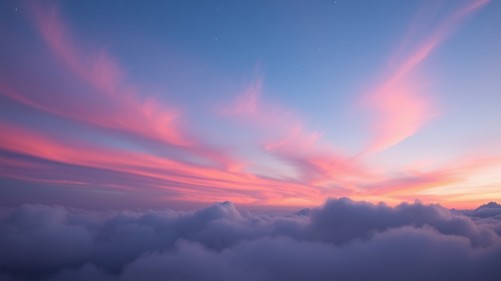
How do you paint realistic clouds without overworking the sky?
Paint the negative space around the cloud first, then add the cloud shape with a slightly lighter value, leaving most of the blending to optical mixing rather than physical smearing.
Clouds are not white cotton balls floating in blue soup. They have form, shadow, and color temperature. The bottom of a cumulus cloud picks up reflected light from the ground—often warm peach or pale yellow. The top catches cool skylight, trending toward pale blue or violet. The secret is to paint the sky around the cloud first, then drop in the cloud color with soft, rolling strokes that follow its roundness.
Here's the thing: cloud edges should be soft in some places and sharp in others. Where sunlight hits directly, the edge can be crisp. Where the cloud dissolves into atmosphere, use a clean Colour Shaper to feather the edge into the surrounding sky. Don't blend the whole cloud. Leave stroke marks in the center to suggest volume and movement. Those marks are evidence of life.
Worth noting: the brightest white in your sky is rarely pure white. It usually carries a hint of yellow, pink, or blue depending on the time of day. Save your pure white pastel—maybe a Sennelier or Winsor & Newton soft white—for just one or two accents. Restraint makes the white sing.
Working outdoors versus in the studio
Plein air pastel painting has its own rhythm. Wind blows dust, humidity changes how paper grips pigment, and light shifts every twenty minutes. (Pack a piece of glassine paper to lay over finished sections—it's thin enough to see through but protects against smearing.) In the studio, you control everything, which is a blessing and a trap. Too much control leads to overworking. Set a timer for forty-five minutes and force a stopping point.
Steps
- 1
Gather Your Soft Pastels and Textured Paper
- 2
Layer Base Colors for the Sky
- 3
Blend and Refine for a Soft, Dreamy Finish