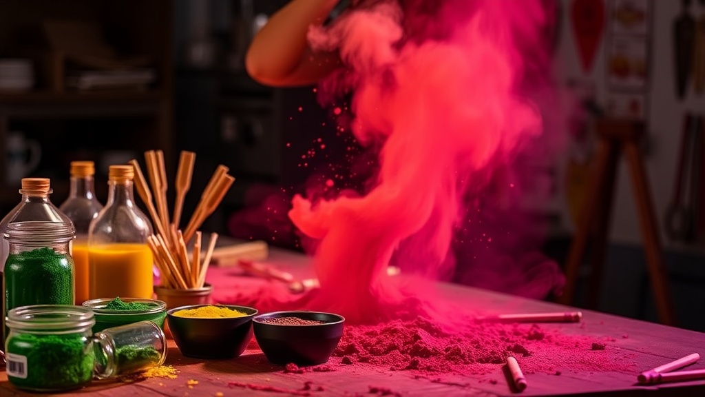
7 Color Mixing Recipes Artists Rarely Talk About

Challenging the Formula Myth
Most artists think color mixing is about memorizing recipes—add cadmium red to yellow, get orange. Simple. Except it never works that cleanly in practice. Paint tubes vary by manufacturer. Lighting shifts everything. And those "perfect" formulas from vintage art books? They were written for pigments that no longer exist.
This isn't another chart telling you that blue plus yellow equals green. You already know that. These seven recipes address the real problems painters face—mixing shadows that don't go muddy, creating atmospheric depth without chalky pastels, and building flesh tones that actually look alive. Each one explains why the combination works, not just what to squeeze onto your palette.
Grab your palette knife. These ratios assume professional-grade paints (artist quality, not student grade). If you're using cheaper tubes, you'll need more pigment and less medium to achieve similar saturation. Adjust accordingly.
What Makes These Color Mixing Recipes Different from Standard Charts?
Standard color wheels show idealized versions of pigment behavior. They assume pure primaries—which don't exist in real paint. Every tube in your collection contains trace minerals, fillers, and manufacturing byproducts that shift how colors interact. These recipes account for that messiness.
They also ignore the traditional red-yellow-blue primary model in favor of combinations that solve specific visual problems. You'll see split-complementary approaches, earth pigment shortcuts, and opacity tricks that academic training rarely covers. The goal isn't theoretical perfection—it's practical results on canvas.
Recipe 1: The Living Flesh Tone (Without the "Doll" Look)
Titanium White (2 parts) + Yellow Ochre (1 part) + Cadmium Red Light (tiny touch) + Viridian (pinch)
Most flesh tone recipes stop at white, yellow, and red. That's why portraits look like plastic dolls—too warm, too flat. The viridian adds a neutralizing coolness that mimics the blood and veins beneath skin. Start with white and ochre, add red until you hit peach, then introduce viridian until the mixture goes slightly gray. Back off one brushstroke—you want it just on the edge of neutral.
This base works for mid-tone Caucasian skin under neutral lighting. For darker complexions, replace titanium white with raw umber and adjust ratios. For lighter tones, increase white and reduce ochre. The viridian stays constant—it's what prevents that artificial warmth.
Recipe 2: Shadows That Actually Recede
Ultramarine Blue (2 parts) + Transparent Red Oxide (1 part) + Alizarin Crimson (touch)
Beginners mix shadows by adding black. Intermediate artists know to mix complementary colors. Advanced painters use this trio—ultramarine's warmth keeps shadows from going cold, transparent red oxide provides depth without opacity, and alizarin crimson adds the subtle violet shift that happens in low light. The result isn't gray—it's deep.
Apply this to cast shadows on warm surfaces. The mixture naturally desaturates as it dries, creating atmospheric recession without chalky additives. For cooler shadows (outdoor shade, moonlight), increase ultramarine and skip the alizarin.
Recipe 3: Atmospheric Haze That Reads as Distance
Titanium White (3 parts) + Cerulean Blue (1 part) + Naples Yellow (1 part)
Landscape painters struggle with aerial perspective. Objects far away don't just get lighter—they shift toward blue-violet and lose saturation simultaneously. This mixture captures that progression. The cerulean provides the cool shift, naples yellow warms it just enough to avoid artificiality, and the heavy white content forces low saturation.
Use this for mountains, distant buildings, or background foliage. Layer it over warmer middle-ground colors while both layers are slightly wet—this creates optical mixing that reads more naturally than flat application.
Which Pigments Create Natural-Looking Skin Tones Without the "Muddy" Look?
The flesh tone recipe above provides a base, but faces require variation. Cheeks need more red. Foreheads reflect more yellow. Eye sockets pull toward purple. Instead of premixing everything, modify the base using these additions:
- For warmth (cheeks, nose, ears): Add cadmium red light or scarlet lake
- For coolness (eye sockets, jawline): Add raw umber or a touch of ultramarine
- For highlights: Pure titanium white with a speck of yellow ochre—never straight white
- For reflected light (chin, nostrils): Add a hint of viridian or cerulean
The key is restraint. Most "muddy" skin tones result from overmixing—aggressive palette knife work that beats the life out of pigments. Mix colors gently, leaving slight variation visible. Your brush will blend them on canvas more naturally than your knife homogenizes them.
Recipe 4: The "Wrong" Green That Looks Right
Ultramarine Blue (2 parts) + Cadmium Yellow Deep (1 part) + Transparent Red Oxide (small amount)
Blue and yellow make green—except they usually make artificial-looking green. Real foliage contains browns, oranges, and reds from dead leaves, bark, and soil. This recipe adds transparent red oxide to neutralize the chemical brightness that screams "painting" instead of "tree." The result reads as living vegetation rather than plastic turf.
Modify for seasons: more red oxide for autumn, more ultramarine for winter evergreens, more yellow for spring growth. The transparent red oxide provides flexibility—it shifts the temperature without killing saturation.
Recipe 5: Rich Blacks Without Tube Black
Burnt Umber (2 parts) + Ultramarine Blue (1 part)
Ivory black and mars black flatten paintings—they're too neutral, too absolute. This mixture provides depth through color variation. The burnt umber leans warm, the ultramarine leans cool, and together they create a black that vibrates rather than sitting dead on canvas.
For lighter passages, add titanium white to this mixture instead of using gray. The result carries subtle warmth that harmonizes with surrounding colors. For darker accents, use the mixture straight. It dries slightly darker than it appears wet, so test on scrap canvas first.
How Do You Mix Shadows That Actually Recede Instead of Going Gray?
The shadow recipe above works for most situations, but specific lighting conditions require adjustment. Here's how to modify it:
Outdoor sunlight: Shadows go blue-violet due to sky reflection. Increase ultramarine and add a touch of permanent violet or dioxazine purple. The key is keeping the mixture transparent—opaque shadows feel pasted-on.
Indoor tungsten light: Shadows warm up dramatically. Reduce ultramarine, increase transparent red oxide, and consider adding burnt sienna. The shadow color should relate to the light source—warm light creates warm shadows with cool edges where light leaks away.
Overcast conditions: Shadows disappear or become extremely subtle. Mix your shadow color from the local object color plus complementary gray, not the recipe above. Overcast paintings require restraint—aggressive shadows look theatrical under diffused light.
Recipe 6: The Highlight That Doesn't Chalk
Titanium White (2 parts) + Yellow Ochre (small amount) + Cadmium Yellow Light (tiny touch)
Straight titanium white kills color relationships—it's too neutral, too cold. This mixture warms highlights to match sunlight or incandescent bulbs. The yellow ochre prevents the harshness of pure white, while the cadmium yellow light adds a subtle warmth that reads as reflected light rather than painted highlight.
Use this for flesh highlights, sunlit buildings, or any surface catching direct warm light. For cool highlights (reflected sky on water, snow shadows), replace the yellows with cerulean blue or viridian in minute quantities.
Recipe 7: The Gray That Harmonizes Everything
Ultramarine Blue (1 part) + Transparent Red Oxide (1 part) + Yellow Ochre (1 part) + Titanium White (2 parts)
Neutral grays isolate colors instead of connecting them. This mixture creates a "colored gray" that harmonizes with surrounding pigments because it contains traces of the three primaries in your palette. Use it to knock back intensity without creating discord.
Adjust the temperature by emphasizing different components: more ultramarine for cool grays, more transparent red oxide for warm grays. This becomes your go-to for background elements, receding planes, or anywhere you need reduced saturation that still feels intentional.
Testing Before Committing
Every painter's hand varies. The pressure you apply, the medium you prefer, the canvas texture you choose—all these factors shift how colors appear. Test each recipe on scrap canvas identical to your painting surface before applying to your work.
Let the test patch dry completely. Oil paints shift dramatically during drying—some pigments darken (ultramarine, alizarin), others remain stable (cadmiums, titanium white). What looks perfect wet might disappoint you dry. Patience prevents repainting.
Document your mixtures. Small sketches with color notes beat memory every time. Write the pigment names directly on the canvas margin or in a dedicated sketchbook. Six months later, you'll thank yourself when a collector requests a companion piece.
These recipes aren't rules—they're starting points. The best painters eventually internalize these relationships and mix intuitively. Until then, having reliable formulas lets you focus on composition, drawing, and the thousand other decisions demanding attention during a painting session.